This simple project is to explore the value of word cloud plot. I am exploring Malaysian COVID19 Twitter tweets.
Full dataset:
The original dataset combines tweets from other countries. I have filtered the tweets based on county_code = ‘MY’. The result produce 4785 lines of tweets to explore. I only take a few meaningful columns, which are tweet, retweet_count, favourites_count, created_at, and lang.
Exploring raw dataset
0 	When will this be over #CoronavirusOutbreak 	0 	12523 	2020-03-05T03:19:35Z 	en
1 	I miss those days when I sneeze people would p... 	1 	5107 	2020-03-05T09:54:45Z 	en
2 	Bond movie postponed cuz nobody wants to die. ... 	0 	5107 	2020-03-05T11:47:07Z 	en
3 	All these days software was scanned for virus,... 	0 	5107 	2020-03-05T13:27:55Z 	en
4 	#GempakKongsi Maklumat terkini mengenai #Covid... 	8 	870 	2020-03-05T14:46:20Z 	in
... 	... 	... 	... 	... 	...
4780 	#CoronaUpdate #untilltomorrow #malamminggu\n#C... 	0 	183 	2020-03-28T21:26:30Z 	und
4781 	China sold 432million erous>3548crores in m... 	0 	183 	2020-03-28T21:43:41Z 	en
4782 	#StayAtHomeAndStaySafe\n#Covid_19\n#Malaysialo... 	0 	4 	2020-03-28T22:49:40Z 	und
4783 	Please jangan macam tu😢\nKawan2 please #stayat... 	0 	471 	2020-03-28T23:22:16Z 	in
4784 	Why we should #StayHome #MCO #Covid_19 #MedTwe... 	487 	2361 	2020-03-28T23:41:36Z 	en

4785 rows × 5 columns
Columns: text, retweet_count, favourites_count, created_at, lang
As you can see, there are lots of garbage characters and emojis. In some cases, HTML tags exist. If not cleaned carefully, they can cause noise to the dataset as some tag exists frequently and are comparable to other words.
Cleaning & Preprocessing
def unicodeToAscii(s):
    return ''.join(
        c for c in unicodedata.normalize('NFD', s)
        if unicodedata.category(c) != 'Mn'
    )

table = str.maketrans('', '', string.punctuation)
def clean_string(tweet):
    tweet = re.sub(r'http\S+', '', tweet) # remove links
    tweet = re.sub('#\S+', '', tweet)  # remove hashtags
    tweet = re.sub('@\S+', '', tweet)  # remove mentions
    tweet = re.sub('&\S+', '', tweet) # remove html entities
    tweet = tweet.translate(table).lower() # remove punctuations and lower all letters
    tweet = unicodeToAscii(tweet.lower().strip()) # normalize ascii
    tweet = re.sub(r'[^a-zA-Z]+', r' ', tweet) # clean all non-letter string
    return tweet.strip()
From the snippets above, I decide to remove some parts of the tweet that is not useful. The removed parts are links, hashtag, mentions, HTML entities and punctuations. Hashtags are helpful to decide the tweet topic. However, for this task, I remove them as they are not part of the sentence.
vocab = {}
for s in df_text:
  for w in s.split():
    if w not in vocab:
      vocab[w] = 1
    else:
      vocab[w] += 1

vocab = collections.OrderedDict(sorted(vocab.items(), key=lambda x: x[1], reverse=True))
Combine all words and record the number of usages. Sort words according to its frequency of occurrences.
Plotting wordcloud
# by default max_words is 200
wordcloud = WordCloud(width=700, height=350, max_font_size=40,
                      background_color='white', max_words=1000,
                      stopwords=None).generate_from_frequencies(vocab)
fig = plt.figure(figsize=(10, 5))
plt.imshow(wordcloud)
plt.axis('off')
plt.savefig('/content/drive/My Drive/covidcloud.png')
plt.show()
To plot the dictionary, I am using the wordcloud library. You can view the documentation here. I am using the minimal example from the docs.
As you notice from the comment, the default value is set to 200. I found out that setting max_words more than 200 will not add value to the visualization as the image will be too crowded. The stopwords parameter is specified to None, which means I am going to use the internal stopwords collection.
We have to be careful when setting the size. Well, it is not a big deal. But, you don’t want to end up having an image that is zoomed to blur. WordCloud width and height is used to initialize NumPy array to create image pixels, while figsize is in inches. Bigger WordCloud size means more words can be fitted, while bigger figsize will give a zooming effect.
Conclusion
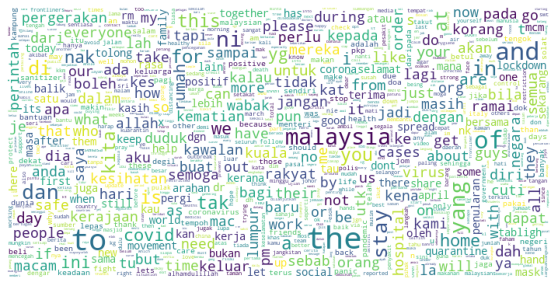
I think wordcloud plot helps to understand the big picture of corpus sentiment. It can be used as an initial analysis which is simple enough to help us:
1) to observe the effectiveness of data cleaning - Are there any non-human words exists? Tags? Weird stuff? 2) to direct our output goals - Setting output class assumption. eg: how many classes? - Is the dataset balance?
For example, Malaysians, in general, are supportive of government orders of movement restriction. This hypothesis is evident from the prominent words such as rumah, kawalan, pergerakan, kawalan, stay, perintah and many more. This plot also gives a good sign that the corpus can be used to analyze How government orders affect Malaysians, which can be classified as effective vs not effective.
View full code here